Down to the Studs
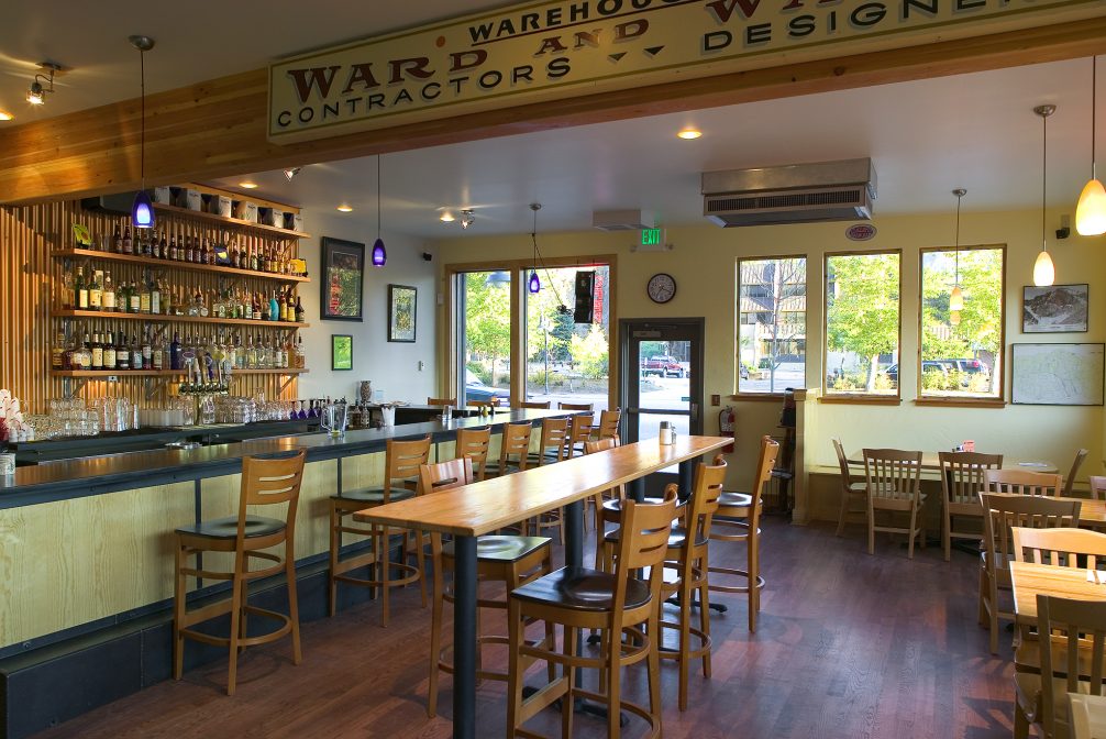
Ed’s Cantina’s original restaurant had two kitchens, three dining rooms, a tiny bar and no connection to the Riverwalk outside the back door. The new plan arranged a new kitchen, central dining room, bigger bar, upstairs banquet room and outdoor seating on both levels – in a smaller footprint. We completely demoed the interior of the building, leaving only the barest structure in place. This allowed for complete reconfiguration of the outdated space to be both more usable, inviting, and better utilize the entire space to incorporate retail into the original building.
The firm’s design provided fresh energy with a mix of modern and traditional elements. The consolidated restaurant plan allowed enough residual space in the building for three rentable retail units to help the owner offset the costs of construction.
Refuge from the Outdoors
Ed’s was long known as a hangout for those after they had spent the day enjoying the outdoors. As a climber’s and hiker’s haven, it was fitting that we created an identity to speak to the need to refuel after adventures in the mountains. Our campaign was based around this fact, promoting the restaurant as a place to come after you’ve “Ski-ed”, “Hik-Ed” or “Climb-Ed”. We created a series of illustrations for posters and t-shirts along with a logo to go along with the completely overhauled restaurant.
Services
Architectural Services
Construction Management
Logo
Poster & T-Shirt Design

